Whipped this out pretty fast. All I did was paste the animations together. I didn’t draw anything.


Whipped this out pretty fast. All I did was paste the animations together. I didn’t draw anything.
This one was kind of difficult. The requester didn’t give me much to go on, so I experimented and came up with this. Here’s the request info I got:
i want a logo for my website:
text: gfxchat
font: check website for matching
colour: check website
size: check website
link to website: http://gfxchat.freeforums.org
Like I said, not much there to go by. I had to do a LOT of figuring and guessing. I didn’t really like doing that because I’m not sure if the size is going to be right. The only way I could get the image size was by screen-snipping the current logo from the website. At least the proportions will be right, so if I have to I can scale the image to size later
Here’s the screen-snip:
I picked a new font, something that would take up most of the space allotted. Then I colored it to match the current website.
I really was at a loss as to what direction to take this. I didn’t care much for anything that was already there, like the skull, the lines mirrored on either side. I didn’t much like the font either, to be honest. It just didn’t look like a game graphics forum logo at all to me. So I took all the liberties I could and changed everything.
Here’s what I ended up with:
I surprised myself with the background. It turned out looking like grass squares out of a Top-Down game. The font muscled up nicely thru the same filter, I just needed to reposition it and change the hue and brightness qualities.
That’s pretty much it, besides the trial and error of figuring it all out. We’ll see if larlarkomo likes it. 🙂
————————–
Here I added some trees I made really quick. The tree on the left has leaves and the one on the right is bare.
I got rid of those pesky corners and shined up the lettering a bit trying for more glow effect.
On the first one, I used a different background. It’s just a plain sheet of metal. I tried to make a reflection effect in the metal background.
The second one has the tiled background with no reflection effect.
The third one is the tiled background with the reflection effect added back in. Since the background looks textured to look like overlapping metal, I thought the reflection effect didn’t work very well.
Click the image to see the full size version. They look much sharper.


The requester liked the first one above and wanted one more without the ‘presents’, so I easily whipped it out. All I had to do was remove the ‘presents’ and move the ‘neon games’ down a little. I also moved the reflection to try and have it show a little more.
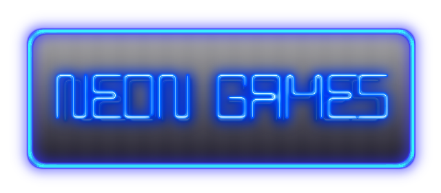
Neon Games Presents. I used the free font called ‘BPneon’ found at dafont.com. This logo took a lot longer to make than I thought it would. I made three versions and I like the third version the best with the darker background. However, I don’t really like the way any of them ended up. I need to clean up the corners. So this one isn’t finished yet.


