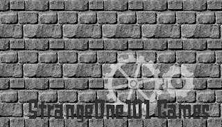
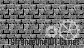
Here’s three more draft changes for StrangeOne101:
This logo is somewhat difficult in it’s simplicity. Each of the 4 items (brick background, text, small gear, large gear) has it’s own layer. That makes it very easy to manipulate. Placement of the gears and the text is the hard part.
The gears, being semi-opaque, slightly blend with the brick background making them look like they’re painted onto the bricks. If they are not placed right, the gears look distorted against some of the bumpy-looking shadows of the bricks.
The text is very close to the same color as the dark spaces between the bricks. If it’s placed carelessly, the letters can be distorted by blending with these dark spaces, and they become hard to read.
As if these aren’t enough to deal with, all three parts have to fit together to look good. The gears need to be close enough with the cogs lining up correctly, and they should match up with the text nicely. In my opinion, if I’m allowed to criticize my own work, the third version in this post works the best in these regards. The text is readable, the gears look like gears, and they’re lined up with the text mostly symmetrically over the ‘101’ and ‘Games’. Plus, with the gears switched around, the corner fills up better and seems to make the overall piece look definite and solid.
The second draft here seems to fit best with the name ‘StrangeOne’ for it’s quirkiness by looking a little off balance. The problem I had with this one (why a third draft exists) was the distorted shape of the cogs in the small gear. I tried various placements for this but couldn’t get the cogs to cooperate. It was either one gear or the other that was a little off. The version you see here was the best I could do.
The first draft, to be brutally honest, I just plain didn’t like.
StrangeOne101, you may have and use any and all of them. Please note the way I’d like to be credited for my work as I pointed out in my first post of the GMC forum post or on my HayMan Designs webpage.
If there’s something not quite right about it, please let me know. I’d be more than happy to change it. The ultimate goal for me is that the person requesting a logo is completely satisfied with it.


